
At the end of last year we announced that we plan to launch EDGE 3, a new version of EDGE (our Clinical Trials Management Progamme) by autumn of this year (ahhh exciting). A new version means a new look and feel of the application which also means a new logo!
Our EDGE 3 logo has already been shared in some past communications but we thought it would be a good idea to shout about it some more and get our users used to the new design and build up some excitement. Oh and because we are pretty damn proud of it. This is also a great opportunity to share with you our plans on our branding so you are kept in the loop as an important EDGE community member (that’s to those of you who are reading this and use EDGE at your organisation).
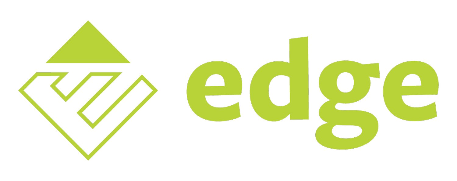
So, over the years you may have seen a few different logo variations knocking about. Most of you will know of the EDGE logo currently used on the database as well as our EDGE marketing logo used on a lot of our printed/digital media and at our well known EDGE user conference (you know you must remember that giant green spinning EDGE light in the main conference room). That’s the one! Well, to make things a little simpler and more cohesive, we are planning on using the one logo going forward from EDGE 3 launch date, so you will see the EDGE 3 logo on the system itself, our website, and on all branding and marketing materials, and of course at the future EDGE conferences (yep that means a new spinning light, banners, new merchandise, and a new outfit for our furry friend EDGEY, our very popular little hedgehog mascot).
The new EDGE logo was created by our one and only Creative Designer Gela Jenssen who designs all of our unit’s graphic materials, animations and creative pieces. Gela has created a more modern and sleek logo which not only represents the EDGE brand in a stronger, more up to date way, but also ties in nicely with the other service groups we supply here at CIRU. This was something that was very important to ensure we inline each of them together to build on the overall brand of our unit, the CIRU brand. When I asked Gela about her new logo design, she explained how it was about capturing and celebrating the unique qualities and values of the EDGE programme and EDGE team, full quote found below.
Your see we kept the EDGE green for the logo (of course) and plan to use this against a selection of on brand colours. The new logo design is more refined and is an evolution of previous logos, it can scale easily and work better in many more places. We hope you like the new logo, it is still very us, still very EDGE. We look forward to getting this rolled out across our print and digital platforms and of course on the new version of EDGE!
Keep a look out for more EDGE 3 updates and news from us coming soon.
“For me personally as a designer, creating the EDGE 3 logo has been about capturing and celebrating the unique qualities and values of the EDGE programme and the EDGE team who is working incredibly hard to make it accessible to everyone and working well 24/7, here in the UK and globally.”